So, you’re thinking about a rebrand? How delightful. Before you get carried away with colour schemes, snazzy new logos, and a slick new website, let’s talk about all the ways you could turn this dream project into a trainwreck. Yes, if you really want to send your brand into an identity crisis—and kill your business—quicker than you can say “design refresh,” just follow these seven easy steps.
1. Who needs facts?
Market research? Focus groups? Don’t be ridiculous. Why bother understanding what your audience actually wants when you can just rely on your gut instincts from that one branding workshop you attended in 2017? Who cares if your customers are left scratching their heads, wondering if they’ve somehow ended up on the wrong website? It’s called mystique.
Let’s take the example of Gap’s infamous 2010 rebrand. They swapped their iconic logo, a symbol that had graced their stores for over two decades, with something that looked suspiciously like WordArt. Their customers? Well, let’s just say they didn’t appreciate the surprise. After a massive onslaught of negativity, it’s no surprise the company reversed the rebrand within a week.

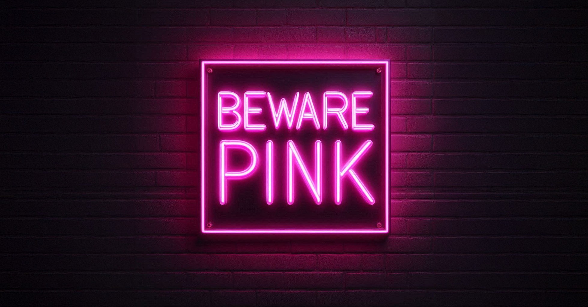
2. Neon pink, anyone?
Ah yes, trends. That shiny neon pink you’ve seen plastered all over social media—definitely a winner. Never mind that it’ll age about as well as a pint of milk left in the sun. After all, why build a timeless brand when you can ride the wave of “what’s hot right now” and then desperately rebrand again in 18 months? The lesson? Trends fade. The customer backlash doesn’t.
3. Confusion is fun!
If you really want to confuse your customers, this one’s essential. New logo, new tagline, new website, new product packaging—change the lot overnight. No warning. No explanation. Your customers will love waking up to a brand they no longer recognise. It’s like a surprise party, but instead of balloons, there’s bewilderment.
Take a page from the Tropicana rebrand disaster of 2009. They completely revamped their packaging, turning their recognisable carton into something so generic it looked like a store-brand knockoff. Sales plummeted by 20%, and within weeks, Tropicana sheepishly reverted back to the original design. Turns out, when you confuse customers about what they’re buying, they stop buying it.
4. They’ll figure it out
Imagine you’ve built up a loyal customer base. Now, throw all that goodwill in the bin by completely ignoring what your existing audience loves about you. You’ve spent years cultivating a loyal following, so naturally, the best course of action is to ignore everything they’ve ever loved about your brand. Why stay consistent when you can alienate your entire customer base? Throw in a new brand voice while you’re at it—preferably the kind of tone that’s warm and welcoming one minute, and ghosting you the next.
5. Budget rebrand FTW
Ah, the old “do it on a shoestring” approach. Nothing screams “we value quality” like cutting corners at every turn. Who needs professional designers or brand strategists when you’ve got Steve from accounting who once dabbled in Photoshop? A DIY rebrand is sure to give off the exact opposite of a polished, professional vibe. Thinking about cheaping out on the execution? Choose wisely, or you’ll end up paying twice as much to fix it.
6. A little chaos never hurt anyone
Why be consistent across platforms when you can experiment with different looks everywhere? One brand voice for your website, another for your Instagram, and something entirely different for your emails. Your audience will be on their toes, constantly wondering, “Who are you, exactly?” Yahoo! is a prime example of this. They changed their logo multiple times in the space of just a few years, each design more unrecognisable than the last. Instead of re-energising the brand, it just confused everyone about what Yahoo! actually stood for anymore. Spoiler: no one really knows—- maybe we should Google it!

7. Leave the team in the dark
And now for the grand finale: make sure your team finds out about the rebrand at the same time as the public does. After all, it’s not like they’re the ones who’ll have to explain it to confused customers, right? A good rebrand is nothing without a little internal chaos to match the external confusion. The real lesson? A brand is built from the inside out. Make sure your team is on board before you take it public.
The bottom line: please don’t do any of this
If you actually want your rebrand to, you know, work, we’d suggest doing the exact opposite of everything here. But where’s the fun in that? Oh, and if you ever find yourself seriously contemplating neon pink… maybe sit down, have a cup of tea, and reconsider. Serious about owning a brand that customers love and competitors envy? Let’s talk.